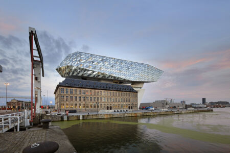
How would Zaha Hadid reflect upon the new “Havenhuis” (Port House), one of her last designs which emblematically appeared in the Antwerp skyline? There’s no doubt that she would be delighted to find that, as a sign of commemoration and appreciation, the square in front of the building has been named after her.
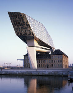
Strategically located at the crossing between harbor and city, her design provocatively superposes – or should one rather say, shelters – a former and listed fire station designed by Van Mechelen in the 1920s. In any case, her design addition is located above the underlying Flemish Neo Renaissance building which in time became too small and outdated. The ensemble of both buildings now house the new office headquarters of the port authority, an autonomous harbor entity which deals with Antwerp’s maritime interests. This complex tale of these two buildings makes it an intriguing project in terms of heritage, interior architecture, engineering and architectural competitions.
The architecture by Zaha Hadid speaks louder than words. The building evokes a bold narrative of a Antwerp as a dynamic port city hosted by an affluent port authority; It also has all the potential to become a global landmark but also presents a local connection between the harbor and city; As could be expected from Zaha Hadid and her team, the faceted built volume in glass and steel reacts intelligently to existing and even future urban settings. For instance, the rippled skin intends to reduce noise from nearby highways.
The preparation for this architectural enterprise has been exemplary. The writing of the design brief – was supervised by the then Flemish ‘Bouwmeester’ (i.e. building master), Marcel Smeets. He coordinated the “Open Oproep” platform, a governmental open call which offers architectural offices to join a competition on the basis of their portfolio. Zaha Hadid’s office successfully competed with names such as Rapp+Rapp and Xaveer De Geyter. Her initial building program envisaged a renovation of the existing building, a parking space, an 12,800 sqm new office building for 500 people, which would bring different administrations of the port authority under one roof.
The engineering part has been a spectacular endeavor too. The Belgian engineer, Guy Mouton foresaw two gigantic concrete columns to support the whole new building structure. On top of these two legs, a complex steel structure made of prefabricated trusses was welded and assembled on site. Ingeniously, the whole new insertion does not touch the old foundations and overarches the existing building. The only point of encounter is a glass circulation shaft which passes through the existing tower of the fire station projecting the visitors into the underbelly of the building.
What makes the building project more interesting is its heritage aspect as monitored by Origin Architecture & Engineering. As the edifice relates to the old fire station below, Zaha Hadid’s building is not freestanding. Inside, many aspects of the old neo renaissance building have been safeguarded such as typical corridors and details, making the project more acceptable for the potentially critical heritage review committee. For example, it still contains a tower where the fire brigade used to dry the water hoses.
Unfortunately, once the building was finished, it turned out that it has cost more than publicly announced which makes it rather vulnerable in the eyes of some critics. Their comments range from an expensive folly to an architectural masterpiece. Indeed, one could categorize the building as yet another example of star architecture. However, this analysis would be too easy.
As Zaha Hadid’s intervention with skewed corners and seamless interiors unleashes an incredible energy to its surrounding , it almost inverts the logic of the old enclosed building underneath. The irregular ripples of the outer skin are entirely made of glass, making it into a dynamic artefact which seemingly escapes the laws of gravity. However, the stark difference between the old and new seems to provide an irreconcilable tension; a tension that is unbearable for some, perhaps more so in time when the buildings will age. The real challenge was to make this building acceptable in the given complex urban and institutional context. How it will win the hearts of the public, is another question. In all, a fascinating and complex architectural chapter has been written by a vast (inter)national network of builders, technicians, engineers and architects.
Pictures: © Hufton Crow


