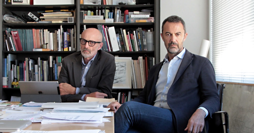
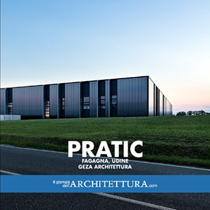
A dialogue with Stefano Gri and Piero Zucchi, architects of the new headquarter of Pratic company that, run by Dino and Edi Orioli, is built in Fagagna (Udine). The new buildings are the focus of the second book of our series “Monografia del contemporaneo”
1999-2019: twenty years have gone by since the foundation of your studio. What sort of “review” would you give?
Ten years of slow development, nine year of deep crisis, one of clear improvement. Now is the time to have faith and grow, not the time to take stock of things.
This extremely brief account explains the background conditions, although these years have revealed some positives.
For example, inside the studio – during the “struggle to survive” after 2008 – we became aware of the constant quality we had achieved in our approach to the design and construction of a project. Each of our works is recognised for its rigour and precision and is widely publicised by the media worldwide. Now is the time to describe the value of our “synthesis of ideas, beauty and functionality”.
The easily understood structure, the design of the technological details and the prefabricated components are topics which are reminiscent of the best Anglo-Saxon, structuralist architecture to which you add sophisticated, minimalist aesthetics. An architecture which requires architecture to be integrated with engineering and collaboration with industry. How do you value the progress of Italian industry (especially as regards the production of heavy prefabrication systems) and, last but not least, of construction site workers?
The Italian construction industry possesses great qualities and skills. Not by chance have many companies of Italian origin become well-known in the USA and in Canada for the construction of complex engineering and architectural works, including infrastructures, bridges, skyscrapers and public buildings. Some have even become established throughout the world.
As regards prefabrication, many companies in Italy went under during the crisis of recent years. Those that have survived have, in our experience, developed their research into systems of structures and foundations, although they have not followed the same route for finishing systems. Obviously, there is a natural evolution during a crisis. However, we think this should be considered a fundamental aspect.
The use of monochrome and the trend towards pure colours, such as black and white, are some of the themes in your architecture. What determined these choices?
Although we can’t exclude or ignore engineering or economic logic, architecture can simultaneously lean towards formal abstraction, such as its relationship with the surrounding context, which is not necessarily part of the original, functional theme.
Starting from the bottom, from a specific “prosaic” problem, we can stretch upwards towards an abstract, intangible dimension.
We believe the use of pure colours is a search for the abstract, to achieve a “timeless infinity”.
Black and white tends to clearly define the bonds between shapes and volumes, even within the surrounding context.
For example, the great industrial volumes “dressed” in black integrate perfectly, when they relate to the natural landscape.
Nevertheless, the black used in architecture has very many shades and defines the relationships between opaque and glossy surfaces. It allows a great deal of light to be absorbed and reflected, it gives intense depth and lightly mirrored effects.
Lastly, monochrome is part of a desire for clarity in our works, where materials are normally used in their pure, natural state.
Colours are guaranteed by the material’s natural colour – marble can be red, wood amber – and by the external views, such as the green, agricultural landscape, which permeates the Practic offices.
Another theme is the rigorous, essential lines of the shapes, which give a great feeling of presence in the landscape. Can you explain how your interest for this pure, geometric language began?
Architecture has to hold together different “scales” of interpretation, from the views from the road at 100 km an hour to the details of the windows and doors people will be using every day.
More specifically, our projects for industry are large enough to withstand comparison with the surrounding territory and the landscape. This is a field, which enables you to reason with the relationship between artifice and nature, between a figure and the background.
Architecture becomes topography, as in some of Alvaro Siza’s projects – the swimming pool in Leca da Palmeira – and above all, Landart’s great works of the 60s/70s. From that world we have learnt that large geometric figures – when gestures are simple and basic – are still the most radical and poetic answer to the search for a relationship between the territory and human intervention on this scale.
We are talking about redefining simple gestures: horizontal and vertical, repetitions and rhythm, light and shade, a straight line and a curved line, coloured and neutral signs, which re-establish a system to measure the territory.
They become coordinates, through which the world’s shape is detected and then revealed.
Furthermore, according to the ideas of the engineer Stefano Zorzi on infrastructures on a national scale, “these works must integrate with the environment without domineering it; however, under the species of Permanent Works, not subject to temporary architectural styles or capricious fashions; constructed using the technology of the day, but appearing to be timeless.”
Industrial architecture in Italy does not yet have a widespread clientele and remains an area for the high end sector. How did you become involved with Pratic and how did you get on with Dino and Edi Orioli?
Italy actually has an important tradition of top quality, industrial projects. For example, there is no lack of positive examples of attention to the relationship between industrial architecture and the surrounding context – from Adriano Olivetti’s intuitions to the works of Gino Valle, to Jean Nouvel’s Chilometro Rosso, to mention but a few. These buildings have come to represent the territory of which they are part for their symbolic image (quality of the work environment and social wellbeing) and for the attention the designers have paid to their inclusion within the territory. Practic is just that.
And our relationship with Dino and Edi Orioli works because clients and architects believe in the same values: simplicity and efficiency. Thus, individual competencies are respected and the building is constructed via a process of commitment and involvement of clients and architects around the same table with discussions down to the finest detail. This is how the building becomes a place of work and contributes to the landscape at the same time.
A topic that was initially functional tends to take on an abstract, poetic quality.
The Pratic project contains many virtuoso elements, such as the 80 m-long cantilever beam, the precise line of the ridge of the volumes, which required the systems to be hidden. How difficult is it to control the process to obtain these results?
The process needs to be controlled continually. First and foremost because the people involved in creating a building are numerous, with different professions and different desires that don’t always go in the same direction. And then, because every stage in the work tends to “forget” the preceding stage. Only the architect has the overall view of the end result before it has been constructed, and plays a fundamental role of “stage direction” from the first to the very last day of operations. It is essential to continually change your viewpoint, “zooming” in from large to small and vice versa, without forgetting a single step.
Pratic 1 features dark panels alternating with different textures, to which the iridescent panels of Pratic 2 are added. What logic made you choose the second type of panel?
The theme of “doubling up” to adjoin an already well-known building is a complex project.
The first Pratic, black and physical, appeared to come out of the ground like a volcano and rooted the building into the location; the second, again black, but reflecting and iridescent, reflects the landscape and the light and gives back ever-changing images.
Initially, it was a question of putting down roots, of colonising a new place, whereas in the second part, the architecture sheds its skin and finds a lighter connection with the landscape, not merely with the earth, but also with the sky.
Nevertheless, the entire complex has certain common elements. The system of vertical openings is always the same and the design of the “embankments” sets it into the surrounding agricultural landscape.
Sustainability is an integral part of your design. Can you tell us of the difficulties of this integration and what it means to you?
Nowadays, sustainability has become a major topic of discussion and is, therefore, easily misinterpreted or abused. Furthermore, it is often reduced to a simple question of energy saving. It is actually a fundamental topic, which should be faced scientifically and, above all, should involve all aspects of the project.
For example, it is not only the quality people perceive (inside and outside the building) which concerns sustainability, but also the approach to designing the structures: a calculation method, which seeks a light structure and enables less steel and cement to be consumed via detailed intellectual activity.
We believe it is not just a question of energy, but is linked to good construction and the people’s quality of life. Recently, the world of international certifications has also gone down this route. In addition to the Leed certification (which verifies construction quality parameters) we now have the Well protocol, which assesses the type of internal environment generated. Thus, the internal user can be placed back at the centre of the project.
Can you tell us something about the projects your studio is currently working on?
Geza Architettura is working mainly on the architecture in the workplace to construct new buildings and to renovate and reinterpret existing buildings. To give life and a new character to existing productive buildings is a sector in which there will be a great deal to do in future. We are working in many Italian regions with Italian and foreign clients. We believe that a project for industrial architecture is a great opportunity to rethink the pair architecture/nature and to refocus on man.










[…] Leggi l’intervista in lingua inglese […]
[…] Leggi l’intervista in lingua inglese […]