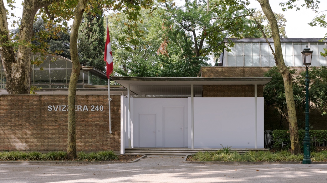
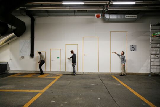
 240 is the magic number and within the Freespace it will be the unit of Svizzera 240: House Tour, the Swiss presence at Venezia Biennale 2018. Commissioned by Swiss Arts Council Pro Helvetia and edited (after a call for selection) by Ani Vihervaara, Alessandro Bosshard, Li Tavor, Matthew van der Ploeg (assistant lecturers and researchers at Zurich ETH, photo on the left, credits KEYSTONE/Christian Beutler), it focuses the housing issues with innovative and unexpected points of view and a rich atlas of images and scenes. In this interview the architects present the tour, material and photographic, they’re proposing inside the Swiss Pavilion at Biennale Giardini.
Why did you choose housing as topical and emblematic issue? What is in your view the contemporaneity of the topic?
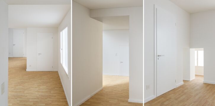
The focus of our installation is on the image of the unfurnished interior of collective housing. In many ways, the appearance of apartment’s interior shell is not new or contemporary: since the start of the 20th century, the apartment’s quintessential architectural palette has consisted of a ±240 centimetre volume dressed with white walls, skirting board, wood or tile flooring and increasingly standardised components and fittings. This is what interests us. In its consistency and ubiquity, the apartment’s interior might be considered one of the most successful modern inventions! One key to the longevity of the interior’s aesthetic has been its self-effacement, its ability to elude the purview of architectural representation by hiding behind the more rational or quantifiable metrics of the floor plan. In the latter half of the 20th century, one can identify a split between architecture, housing and its interior. Architects took over the plan and the image, the material presence of the interior, was handed over to popular culture (such as home furnishing magazines) or to other design fields. This split between housing-as-plan and housing-as-image is contrasted by the increasing prominence of unfurnished photographs of apartment interiors within Swiss architectural media. We call such photographs house tour images. In these images, the apartment’s inner shell is momentarily taken out of context, the architectural background is brought to the foreground. We take these images as an invitation or opportunity to bring the image or appearance of housing back to the center of architectural attention and to reevaluate its role in the present-day context.
What is Freespace in your vision? How can you integrate the general Biennale topic into the pavilion’s program?
We understand Freespace as an architectural search for potential, generosity or surprises that are latent within the world, the city or, for us, the apartment. In this way, Freespace frames architecture as a speculative practice. One tool that architecture has for discovering or uncovering this overlooked potential is representation itself, architectural representations solicit alternate ways to see the world, allowing us to discover new possibilities in either the most everyday or the most restricted conditions. We put forward the house tour as a new form of architectural representation. House tours are a global cultural phenomenon, but, in Switzerland, house tours play a special role within the architectural production of housing. The house tour (whether experienced in person or through photographs) redirects the professional gaze towards a consideration of housing not only in terms of its planimetric efficiencies or quantities, but also toward the qualities or potentials that arise when a flat is understood as a specifically visual and material entity. Yet, for us, the value of the house tour and its image lay not only in its ability to passively document the qualitative richness of built artifacts, but also in its ability to actively frame and construct a very specific architectural vision or sensibility. We dramatically exaggerate this potential in our installation in an attempt to highlight the speculative, participatory nature of architectural representation.
How are you managing with the pavilion’s building? Is it impacting your program?
Actually, everything started with the Swiss pavilion. When we decided to apply to the open call to curate the Swiss contribution at this year’s architecture Biennale, we started by studying Bruno Giacometti’s pavilion. Giacometti wanted to create a space where visitors would feel comfortable, like in their own dwelling. Marcel Meili once described him as “one of a number of Swiss architects who had set out to forge an unspectacular, more homey variant of modern architecture.” Maybe this is why, if you disregard the scale, the plan of the Swiss Pavilion looks a lot like the plan of an apartment.
Cover Photo: Swiss Pavilion in Venice for “Svizzera 240 House Tour” © Alessandro Bosshard, Li Tavor, Matthew van der Ploeg and Ani Vihervaara










[…] InterviewsJayne Kelley, UICAnnalisa Rosso, DomusFinn Canonica, Das MagazinVera Kaps, BauweltMichele Roda, Il Giornale dell’Archittectura […]