The newly enlarged San Francisco Museum of Modern Art opened to great public and critical acclaim in mid-May
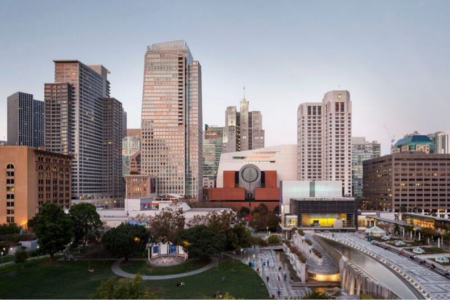
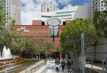
The new museum brings together hugely expanded exhibition spaces (tripling the original capacity of the museum) and the Fisher collection of postwar and contemporary art (about 1,100 individual works of art). The 10-story expansion designed by Craig Dykers and his Snøhetta team also renovated, and in some cases transformed, the original 5-story building (1995) by Mario Botta.
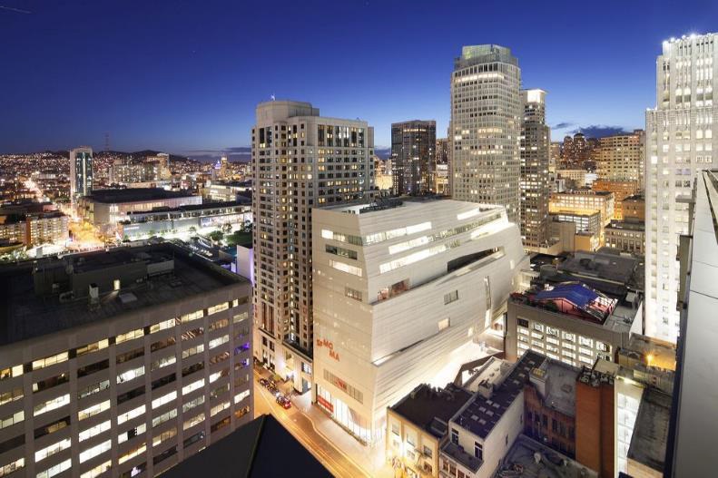
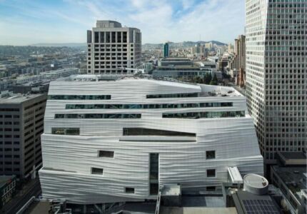
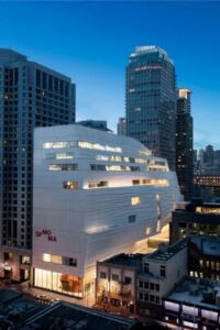
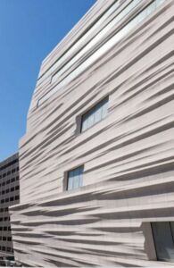
In the new configuration the older building becomes a pharaonic gateway for the new wing. The new wing is a sinewy rectangular slab set at 90 degrees to the blocky, circle-in-the-square original; the contrast between the old and new wings is also made through color – the innovative cladding in rippling grey-white fiberglass-reinforced polymer panels by Snøhetta counters Botta’s brick cladding striated with black stone. The Snøhetta addition, inserted, one might say shoe-horned, into the center of the city block with a narrow frontage to the adjacent street treated residually, can really only be seen in fragments, and that only from the upper floors of nearby-buildings, as its press images confirm. This rear façade seems to count on the eventual demolition of the encroaching adjacent but small buildings. The site that they occupy could then be turned into an entry square, and a platform from which the Snøhetta building will emerge in all its sinuous glory. For now, journalists, critics and the public have seen in it a cruise ship (New York Times), an iceberg, a slumped meringue (The Guardian).
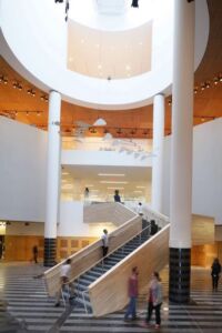
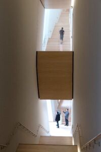
Snøhetta have made exemplary use of this siting challenge. The entry staircase that pulled visitors up through Botta’s signature cylinder has been turned into a more comfortable and transparent ascent, toning down the original monumentality through its use of exposed blonde wood for the steps and balustrade, deemed unsuccessful by most critics for its scale and reference to Scandinavian traditions. The two parts of the museum are knitted together at the second level, where the entry is now located. The separate entry of the new wing also converges, after a series of elaborate outdoor and indoor staircases, on this double-story entry hall, animated by light pouring from clerestory windows.
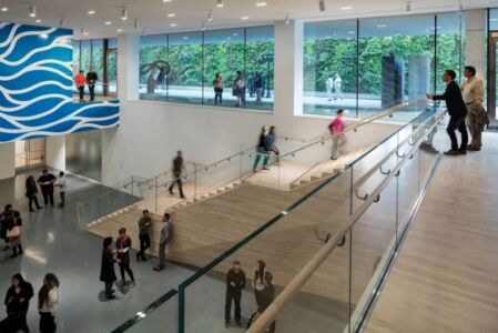
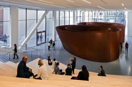
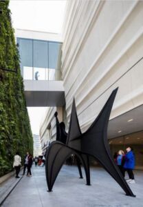
Staircases rule, and not only organize the connection between old and new, but also structure the new wing. They are part of the amphitheater setting at the new entry—allowing visitors to rest and to enjoy the monumental sculpture by Richard Serra, and for the architects to quote Diller Scofidio and Renfro’s recent introduction of this architectural form at the Lincoln Center in New York and the synchronously built Art Museum at the University of California in Berkeley. Staircases occupy the strip of space parallel to the long facade of the new building, offering vertiginous views of cascading steps not unlike those at the Kunsthaus Bregenz by Peter Zumthor, but here softened by light from the huge and deeply set windows at their floor landings.
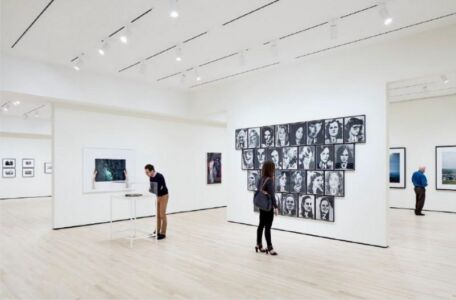
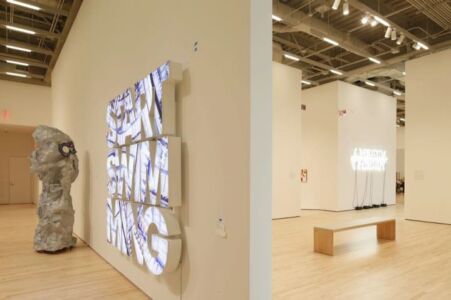
Numerous other amenities and innovations, architectural and artistic, are distributed throughout the building. The deep windows are a welcome respite, but also act as light boxes, framing views of the city, a detail successfully applied by Yoshio Taniguchi at the MOMA in New York (2004). The gallery spaces that take up the floor space of levels four to seven are artificially lit, and they contain the Fisher collection. This essential donation, which has transformed the SFMOMA into the largest museum of contemporary art, so dominates the contents of the new building that some critics have seen it as the Fisher museum in anything but name (a name well-known in San Francisco, while the source of the Fisher’s wealth—the Gap and other moderate clothing brands—is a global common coin). [In a recent nearby development, the donors of the Anderson Collection at Stanford University have also wrangled a new eponymous building for the separate display of their works of contemporary art.] Open air sculpture terraces are dotted throughout, including a dazzling terrace defined by a “Living Wall,” vertically landscaped in the innovation pioneered by the French Patrick Blanc (see Le Mur Végétal, de la Nature à la Ville, now available in French, English and German editions), and dramatically displayed–in the USA and Israel pavilions, for example–at the 2015 EXPO in Milano.
Thus SFMOMA, together with the new museums at Berkeley and Stanford, transforms the museological scene in the Bay area. A welcoming space, with refreshing connections between inside and outside, it accommodates its art effortlessly, and in its exterior form may well offer generative inspiration for subsequent architectural and urban developments.
Main picture: Snøhetta expansion of the new SFMOMA; photo: © Iwan Baan, courtesy SFMOMA
